Simplifying an information rich Realtor website
Client: Ruth Krishnan, Realtor, San Francisco (2015)
Ruth Krishnan is in the top 2% of San Francisco’s real estate agents. Potential buyer and sellers look to her website to learn more about her philosophy and understand San Francisco’s unique real estate market. The task at hand was to create a digital experience that invites clients to learn more about buying or selling with Ruth in the San Francisco market.
Role: UX Designer + UI Designer
Tools Used: Invision, Omnigraffle, Adobe Illustrator, Adobe Photoshop
RESEARCH
How I approached this challenge
My work began with reviewing the old website’s information architecture, visual design, and functional limitations. The most glaring problem was a complex navigation structure and lengthy drop down menus that made simple information harder to find. Working with Ruth, we identified key tasks as follows:
I’m looking to buy, what do I need to know?
I’m looking to sell, what do I need to know?
I’m looking for a trustworthy realtor, I would like to know more about your track record
What's happening in the San Francisco real estate market?
These tasks subsequently translated into the BUY, SELL, ABOUT and MARKET UPDATES pages. After many rounds of discussion, we arrived at an information architecture that is functional. We began to work on the wireframes for each one of the pages.
DISCOVER
Identifying problems and emphasizing goals
Our work started with documenting the current IA and analyzing the content in each one of these pages. After conversations with clients, RK was able to give us direction on the questions that she is faced with when she meets a potential buyer/seller. While a majority of the audience was looking for information about Ruth and the real estate process, more and more people were skewing towards learning more about the neighborhoods and market updates.
The end goal was to come up with a structure/design that balances the users’ desires with the business’s needs. This means we had to:
Assure visitor’s they’re in the right place (always make it clear where they are).
Make it easy for visitors to find what they’re looking for (clear navigation, search etc).
Make sure visitors know what their options are (links like “Property Search”, “SF Market Updates”).

After many rounds of discussion, we arrived at an information architecture that is functional. We began to work on the wireframes for each one of the pages.
DESIGN
Long Scroll Design Trend
To create a more user-friendly website, we started creating concepts that were more inline with how people think of their homes.
A HOME IS MORE THAN FOUR WALLS. IT IS WHERE OUR LIVES HAPPEN.
To make access to information incredibly simple for a new user, we created a home page that give users basic pieces of information from different pages. Reviewing the home page provides a starting point for the user and provides recommendations on other things to look forward to in the website.

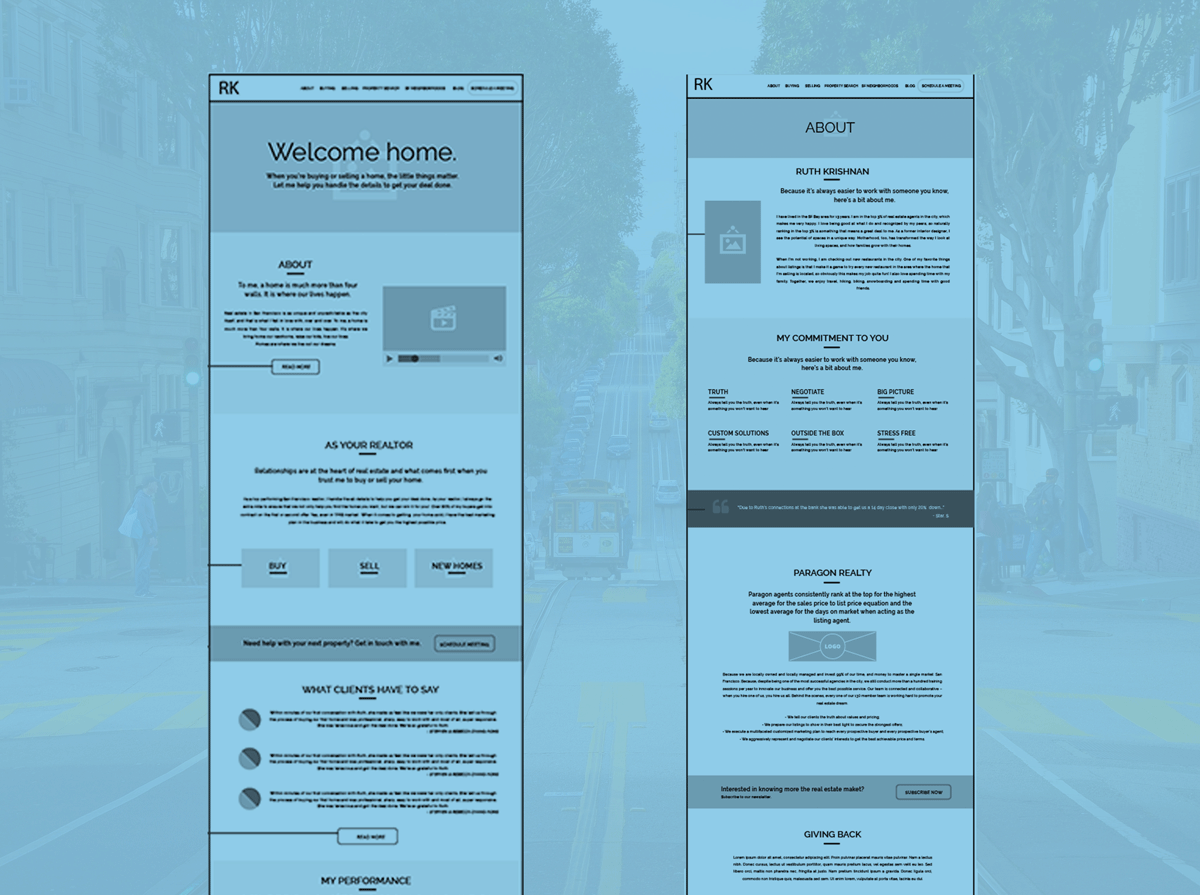
Wireframes
The homepage follows a long scroll displaying different key pieces of working with the Ruth Krishnan team.

About the team
This page was critical to the client due to the number of visits. It was important to get the content and presentation right.