Evaluating an innovative healthcare platform idea

Client: Geevio, San Francisco, CA (2015)
Health care entrepreneur and product management professional was looking to build a beta to test the market for transparency in health care services pricing. The question at hand: Are people interested in shopping for Invisalign procedures based on pricing? Here’s how I approached user experience on a budget.
Role: UX Designer
Tools: Invision, Omnigraffle, Photoshop
PROCESS
My Role
I lead the UX work, producing an Invision prototype for the beta. I was responsible for talking to participants, discovering pain points and designing an interface that makes shopping for a procedure straightforward.
Discovering pain points
Not knowing too much about Invisalign, I started off by reading about the product and procedure. Invisalign® clear aligners are custom-made invisible aligners that shift teeth gradually based on a treatment plan. Typically, patients change aligners every week. The cost of the procedure is steep, anywhere between $3500 - $10,000 which is why we set out to build a portal that helps patients shop for a provider.
The next step was to speak to mothers of teenagers and adults to understand how they found their provider and what we can do to make their experience better. As with all healthcare treatments, it is hard to determine a cost for the procedure, how much insurance covers and what promotions can be applied to their treatment. After speaking to 5 participants, I created a journey map to summarize the findings.
DISCOVER
Key learnings
Yelp is the primary source for finding an Invisalign provider.
The provider needs to be close to their home/office as visits can be frequent.
Promotional pricing is not available online until the patient calls the doctors office.
Reviews and before/after photos help pick one provider over another.
Data collection
One of the key pieces of data that was available to me was an excel spreadsheet with all the Invisalign providers in San Francisco, office information, pricing, promotions and insurance info.
After card sorting through this data, the sponsor and I arranged the data in card to see which delivers the most amount of information succinctly (left).
A few more iterations later here is what we landed on to show the insurance information and tags against each provider to provide quality results (right).
DESIGN
The intention of the beta version was to collect data on the usefulness of the concept. So we kept search as simple and straight forward as possible. Below is the wireframe for the project.
BUILD
UI Design
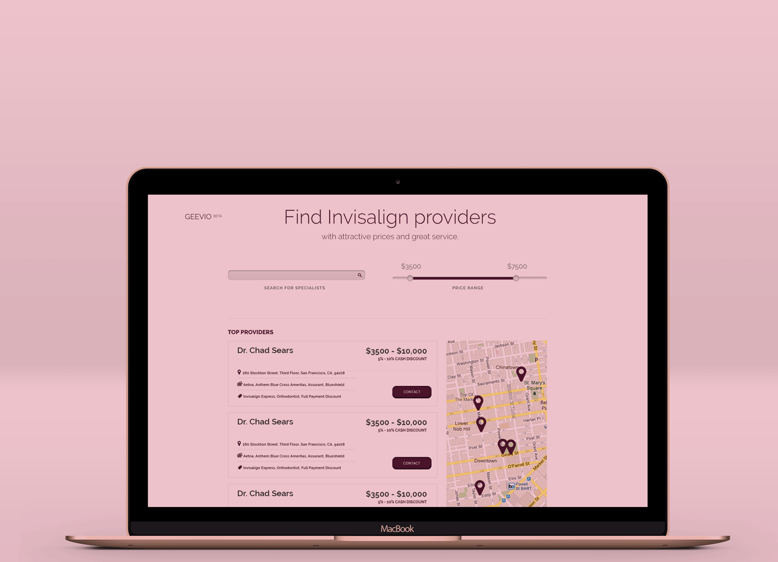
The layout below shows the design for the beta version. We went with a clean aesthetic that keeps target participants focussed on the data and collecting feedback. The design was executed keeping in mind BootStrap components.
TEST
Collecting feedback
As part of the project, the sponsor and I identified what we wanted to measure from the beta.
Participant Demographic
Age, Sex & Location
Occupation
Reason for getting the Invisalign procedure for themselves or dependent?
Are you able to use the search criteria to identify a provider?
Did you use the map to look where the provider is located?
Are the price promotions clear to understand?
What other search criteria would motivate you to find a provider?
Will you use the interface to schedule an appointment with the provider?
Although I did not have the opportunity to run the user tests, it was a great opportunity to learn about behaviors that shape users health care shopping.


